ABOUT US
Corporate Identity
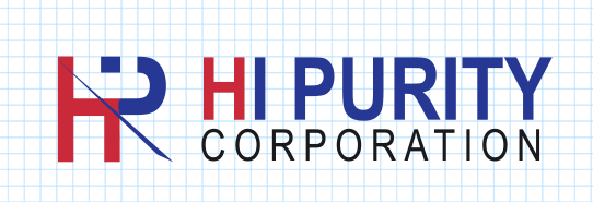
Brand Logo
The brand logo of HI PURITY, which reflects its unique design features and symbolism, plays a key role in delivering the brand image as it is applied across all corporate media channels.
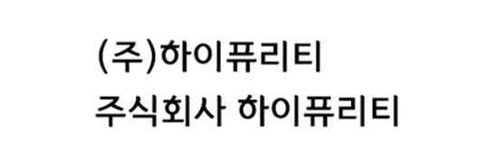
Korean Logo Type
The Korean logo type is designed using the designated font “Yi Sun-sin Dotum M.” The proportions, spacing, and other formatting should not be arbitrarily altered. When needed, use the official data files provided.
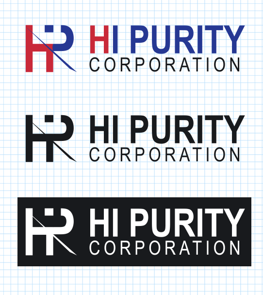
Monochrome Logo Type
While the primary logo should be used by default, the monochrome version may be used in cases where visibility is compromised due to background color or printing limitations.
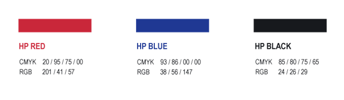
Brand Logo Colors
The colors used in the HI PURITY logo are retained in their original form.
These colors serve as powerful elements that differentiate the brand and convey HI PURITY’s identity and message clearly to the customer.